Color makes a space feel finished. The right tone ties together cabinets, walls, and furniture so the room reads as one—whether it’s a garage, patio, basement, or commercial space. Use this guide to build a short list you’ll still love after the samples are put away.
Start with what’s already set
Lock in the pieces that aren’t changing: cabinet finish, wall color, trim, appliances, and big items (tool chests, a vehicle color that always parks inside). Your floor color should support these, not fight them.
Read undertones the easy way
Neutrals aren’t truly neutral.
- Warm undertones = creams, tans, browns.
- Cool undertones = grays, charcoals, blues.
Hold a pure white printer sheet next to your cabinet door or wall sample. If the surface looks slightly yellow or red against white, it’s warm; if it looks blue or green, it’s cool. Choose a floor color with the same undertone family for a cohesive look—or a gentle opposite if you want contrast.
Use the room’s light to your advantage
Lighting changes everything, especially in basements and garages.
- Low light spaces (basements, shaded patios): lighter blends lift the room.
- Bright sun (pool decks, south-facing patios): mid tones reduce glare and hide dust.
- Mixed light (garages with windows): medium blends keep the look consistent day and night.
Always view samples at morning, midday, and evening before deciding.
Match color to how you use the space
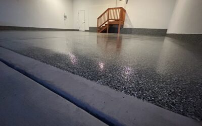
- Garages: choose blends that hide tire dust and scuffs. Mid-to-dark grays with specks of tan or white stay forgiving.
- Patios & pool decks: echo stone, brick, or landscaping so the hardscape feels planned. Lighter neutrals run cooler in direct sun.
- Interiors & basements: pick tones that complement sofas, built-ins, and rugs. Warm blends feel cozy; cool blends feel crisp and modern.
- Commercial areas: consider brand colors for accent flake or zoning lines; keep the main field color neutral for longevity.
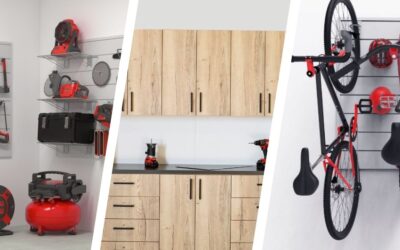
Coordinate with cabinet finishes (and slatwall)
Cabinets are a large visual block; your floor should either blend or deliberately contrast.
- Dark cabinets (Classic Black / Carbon Frozen): pair with mid-light floors for balance and visibility.
- Light cabinets (Classic White / Classic Fog / White Frozen): anchor with mid-gray or warm greige floors so the space doesn’t wash out.
- Wood-look (Natural Halifax Oak): pull a warm fleck from the floor blend to bridge wood tones and concrete.
Slatwall in coordinating colors adds vertical rhythm—keep the floor more neutral so walls and storage shine.
Finish affects how color reads
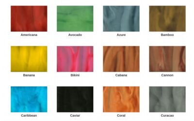
- Flake: most forgiving for dust and day-to-day mess. Multicolor blends “average out” and look consistent from different angles.
- Metallic: deeper, richer color with movement. Great in entries and living zones; test under your exact lighting.
- Grind & seal: the concrete is the star. Sheen (satin vs gloss) changes perceived brightness more than color shifts do.
Three simple paths that rarely miss
- Tone-on-tone: match floor and cabinet undertone; vary lightness for depth.
- Warm + cool balance: cool gray floor with warmer cabinets (or reverse) for a tailored look.
- Natural tie-in: choose a blend that repeats a color from brick, stone, or wood nearby.
Build a short list in 20 minutes
- Pull cabinet, wall, and countertop/vehicle references into the same spot.
- Pick 4–6 floor samples that share your undertone.
- View on the ground near a wall and near the door.
- Remove anything that looks greenish or flat in evening light.
- Live with the final 2 for a day, then commit.
Mistakes to avoid
- Picking from a phone screen only. Always use physical samples.
- Choosing pure white outdoors. Glare and dust win.
- Going ultra dark in a small, low-light basement.
- Ignoring undertones. A “neutral” that clashes will bug you later.
- Over-matching everything. You want harmony, not uniformity.
FAQs
How do I know if a blend will hide dust and dirt?
Look for multi-tone flake with medium contrast. Speckled patterns disguise dust better than flat solids.
Will the floor look different after it’s sealed?
Yes, expect slightly more depth and richer color. View a topcoated sample board if possible.
Can I customize a flake blend to match cabinets or a vehicle?
Yes. Custom mixes are available. Bring a cabinet door or color reference to dial it in.
What about matching floors across rooms?
You can repeat the same blend for continuity or shift one shade lighter/darker to define zones while keeping harmony.
Do metallics show footprints or mopping trails?
Metallics reflect more. Choose a pattern with gentle movement and test care products before first use.
Ready to see colors in your space?
Tell us about your cabinets, walls, and lighting. You’ll get a curated color list and finish recommendations that fit how you use the room. Get a Free Estimate >